- Market Indicator
- OnChain Market Indicator
- OnChain Movement
- Mining
Rainbow Chart – A New Dawn
What Is The Bitcoin Rainbow Chart Indicator?
The Rainbow Chart is a long-term valuation tool for Bitcoin. It uses a logarithmic growth curve to forecast the potential future price direction of Bitcoin.
It overlays rainbow color bands on top of the logarithmic growth curve channel in an attempt to highlight market sentiment at each rainbow color stage as price moves through it. Therefore highlighting potential opportunities to buy or sell.
As with all the charts on this website, the Rainbow chart is not investment advice. It is for educational and entertainment purposes only. There is no guarantee that past performance fit within the rainbow channel will continue to play out in the future.
How to Interpret The Rainbow Chart
Because Bitcoin is still a relatively young asset class, its price movements are highly volatile. Although on a macro timeline Bitcoin is being adopted, which we can see in the general upwards price movement, it does experience market cycles. During these market cycles, the price of Bitcoin can increase parabolically and also drop very quickly. It also has very high daily volatility which investors need to be aware of.
The BTC rainbow chart highlights where BTC price is in those cycles and provides a viewpoint on investor strategy. As mentioned earlier in this article, this chart and its legend labels are for entertainment purposes and do not constitute investment advice.
The warmer upper colors of the rainbow chart show when the market is likely overheated. Such periods have historically proven to be good times for the strategic investor to begin taking some profits.
When price today is down towards the cooler colors, overall market sentiment is typically depressed and many investors become uninterested in Bitcoin. The Rainbow chart highlights that these periods are typically excellent times for the strategic investor to accumulate more Bitcoin.
Why need new Rainbow Chart?
As you may have noticed: The original Bitcoin Rainbow Chart is dead! The chart, which was based on a model developed in 2014, held for quite some time. But after a brutal 2022 in the crypto industry it was just no longer valid.
Since then, we have a lot of new Bitcoin price data. So instead of letting the rainbow chart die or simply add more colors (indigo, ultraviolet anyone?), we remodeled the Bitcoin Rainbow Chart!
So, what’s new?
- The Rainbow Chart V2 is based on a completly new formula, fitted with data until 2022
- The new fit explains every move so far (the old one had a couple of wicks outside the rainbow)
- But due to the recent events the potential trajectory for the Bitcoin Price is not as bullish as the old one
- You can now zoom and pan into the chart as you like
- You can add more years to the rainbow chart
What hasn’t changed?
- We kept the legend labels and the colors (still no indigo)!
- The rainbow is still not a full rainbow that goes back down, because that is not how Bitcoin works!
How does the new model work?
We fitted two curves. One that is the best fit for all of Bitcoin highs (red) and one that includes only the lows (blue). The rest we just interpolated. The result is this beautiful rainbow that will hopefully have a brighter future than the old one. As you can see, even in the new model we are in the lowest “Fire Sale” band, so fingers crossed!
Fall Further Down The Rabbit Hole
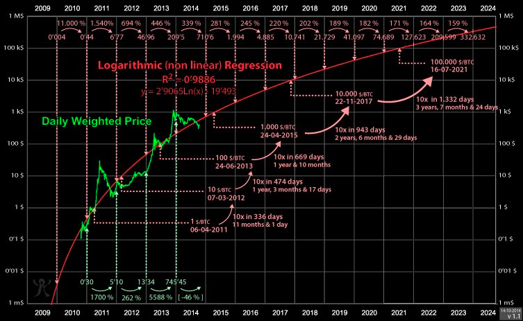
The first example of a logarithmic regression curve for Bitcoin was created by Bitcoin Talk user trolololo. This is the original chart, which shows how $BTC price could potentially evolve over time using log growth regression analysis:

You can check out this link if you would like to view the original discussions and idea-sharing around the Bitcoin logarithmic growth channel that initially took place back in 2014 when the price of 1 Bitcoin was just $385.